Laithwaite’s
Wine? Design?
Why not both?
The brief
Direct Wines were looking to evaluate, optimise, and redesign their existing mobile user journeys in order to retain existing customers and appeal to new ones.
We stepped in for an 8-week DUXD (Data-Driven User Experience) engagement.
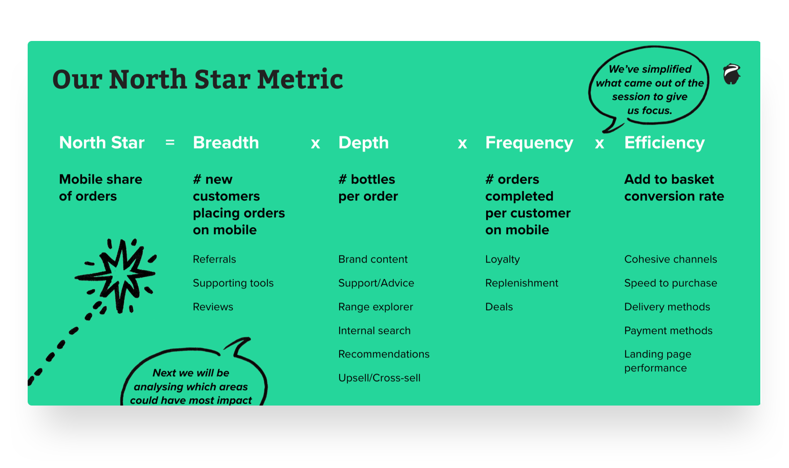
North Star Metrics
To define success for the project, we started by holding a workshop to introduce the concept of a North Star Metric, together with the extended Laithwaite’s team.
This enabled us to understand what to measure and what drivers and potential features would influence those metrics.
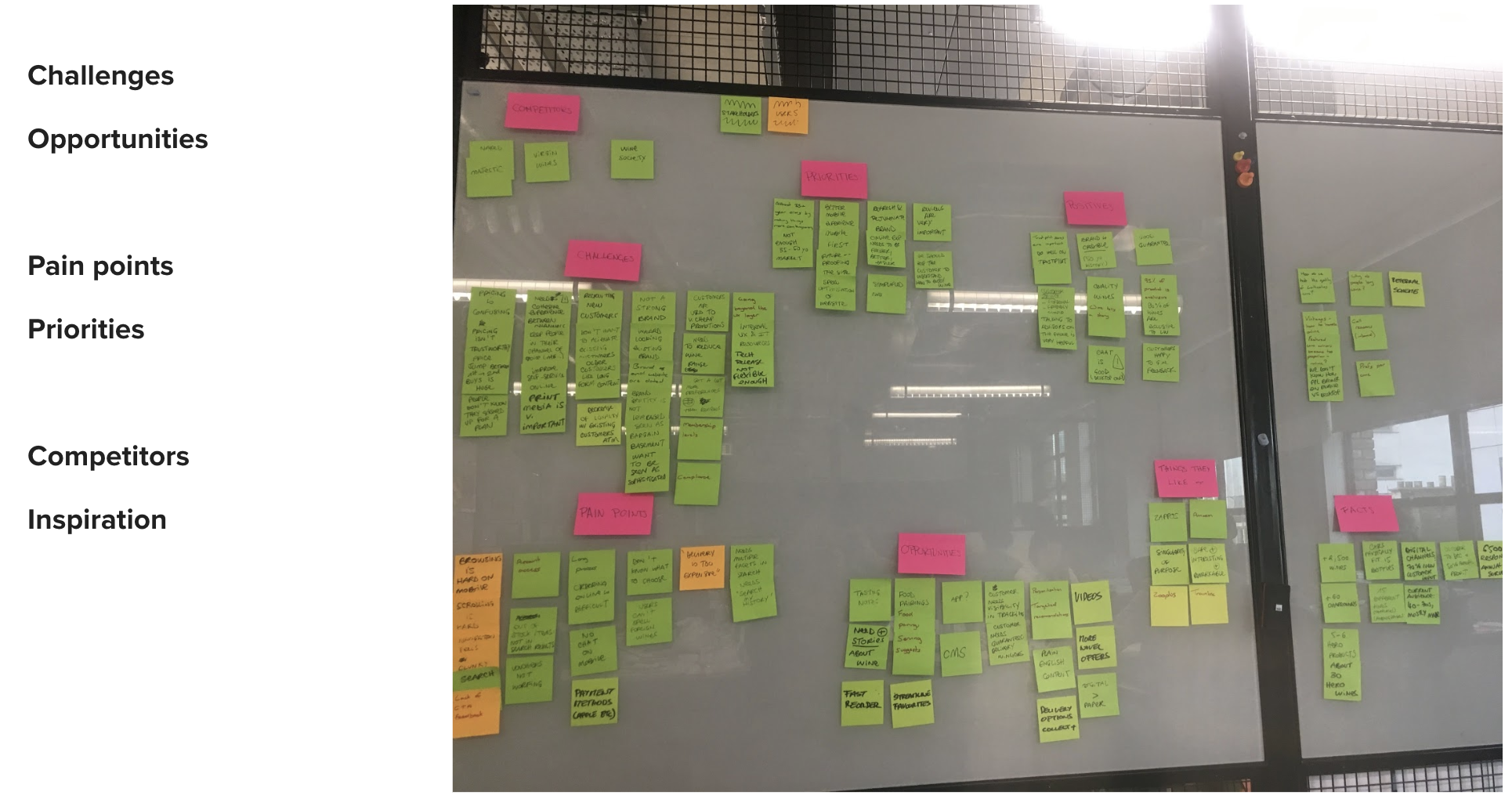
In parallel, we conducted an initial data analysis, quantitatively, and user iterviews, qualitatively.
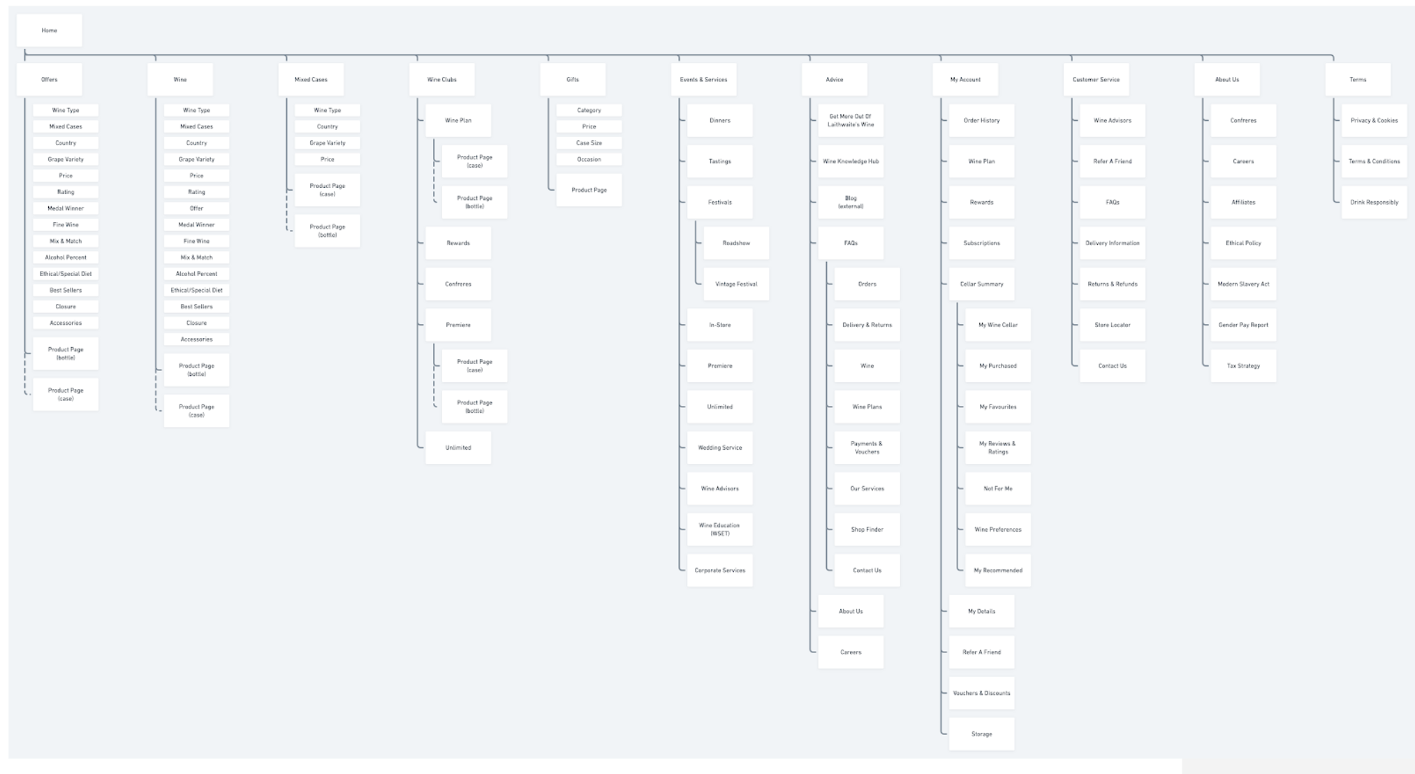
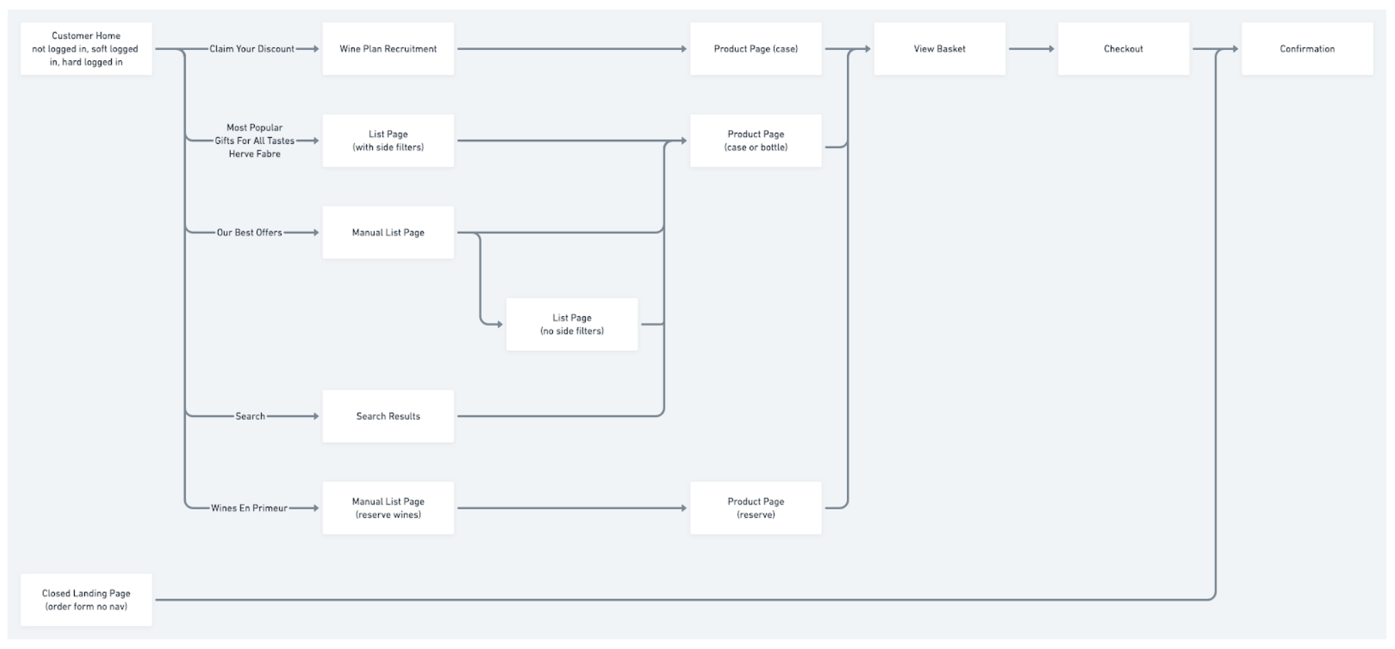
We also mapped the existing site and the “standard” purchase journey.
Teardowns
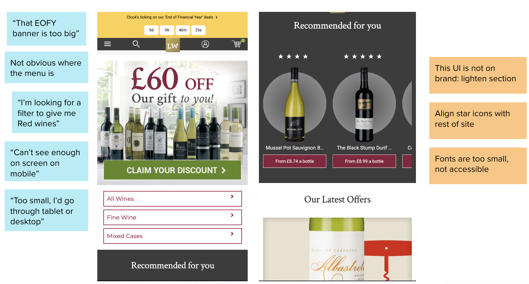
We documented teardowns at two levels: first, for the existing site, relying on testing data and best practices, outlining recommendations.
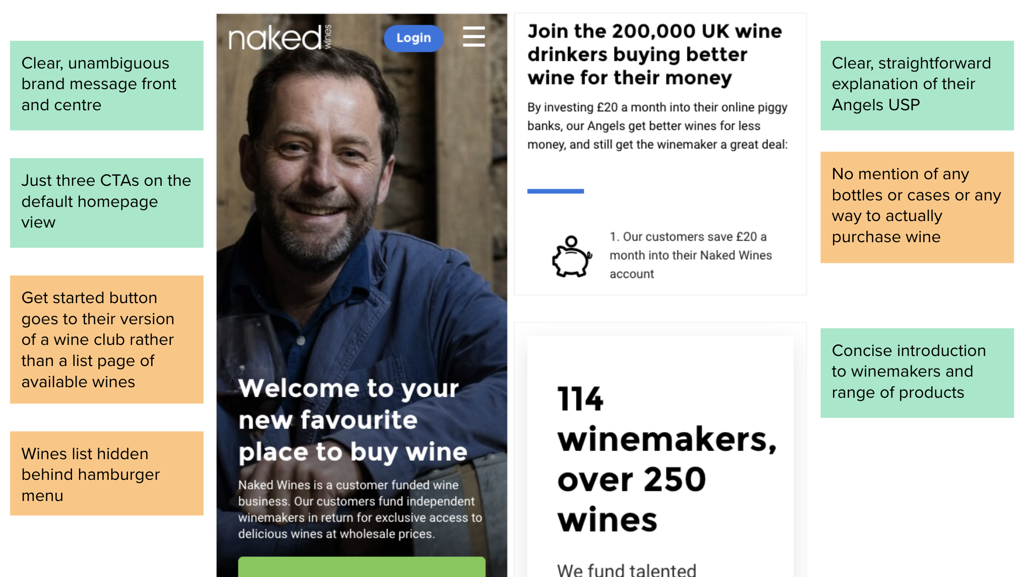
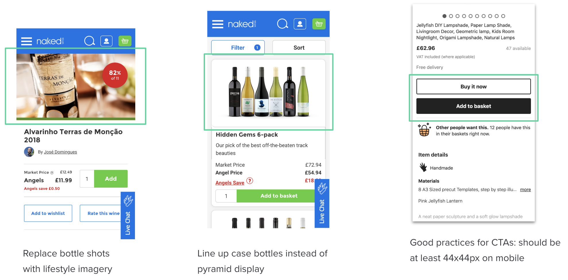
Second, we also looked at benchmarking and competitor research and outlined good practices and potential improvements that could be made. The stakeholders had a clearer picture of what ‘good’ looks like, that way, even though we wouldn’t be able to build everything in the short timespac of the project, they’d be well-armed to tackle some of these points themselves if they so wished.
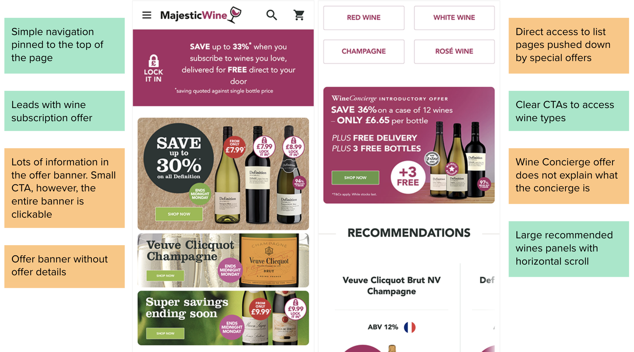
Design Approach
Small things, often
The Laithwaite’s brand was in the middle of a rebrand, which wouldn’t take place for a few months. They still wanted to improve their revenue in time for peak (Christmas sales).
We reworked the design system and conducted experiments to make low effort / high impact changes. We made recommendations based on best practices and what we identified with the teardowns
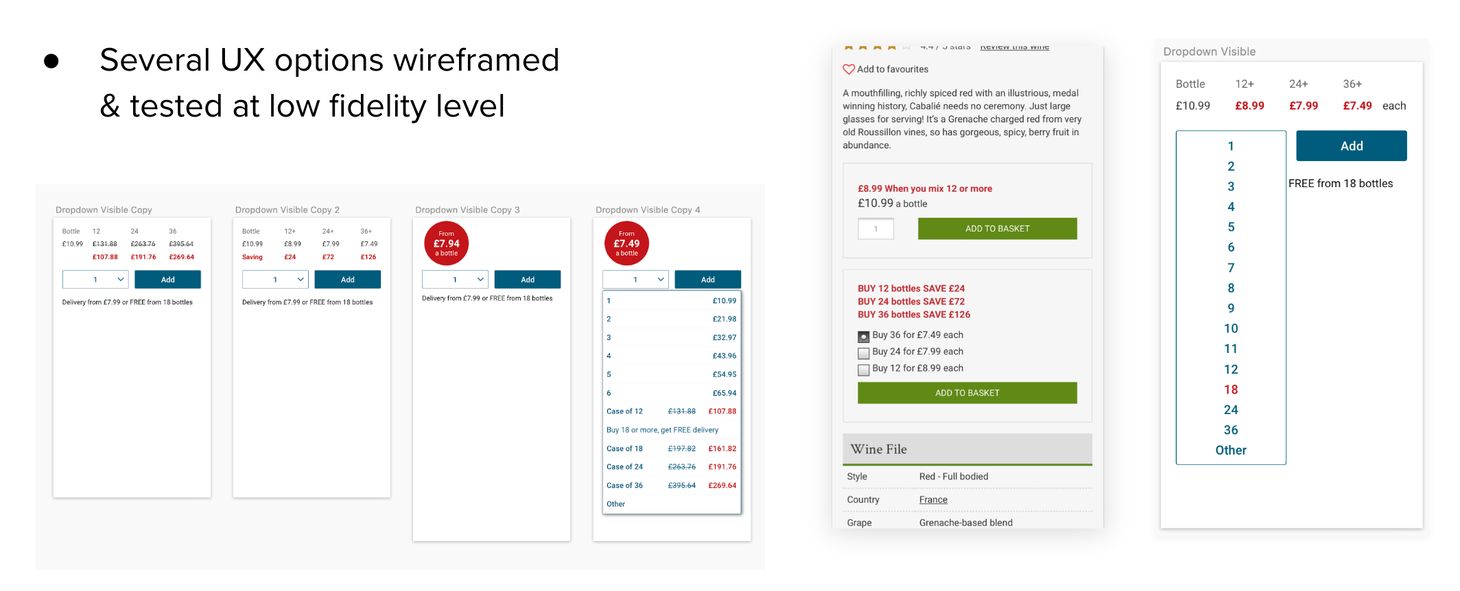
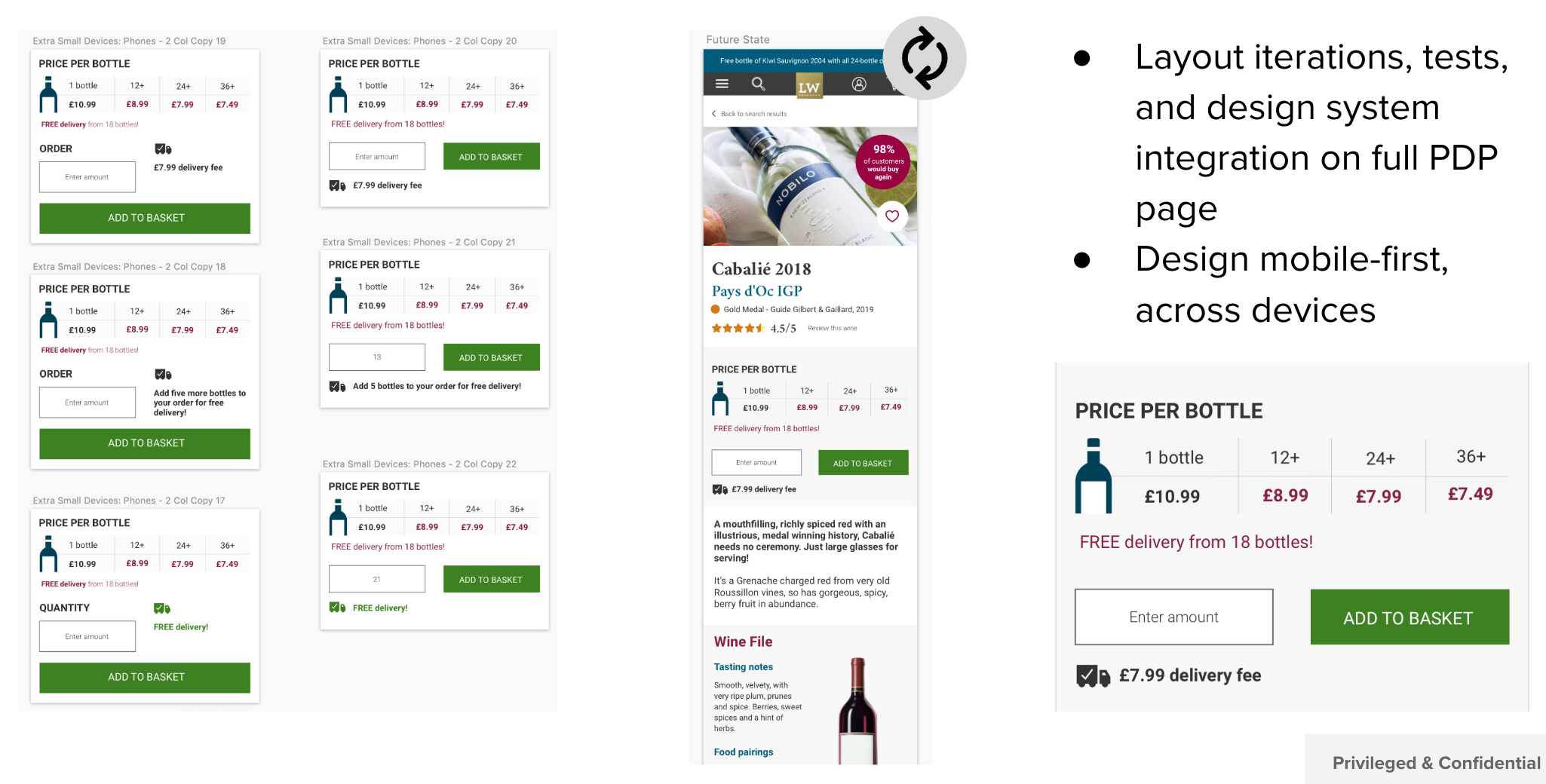
Atomic Design
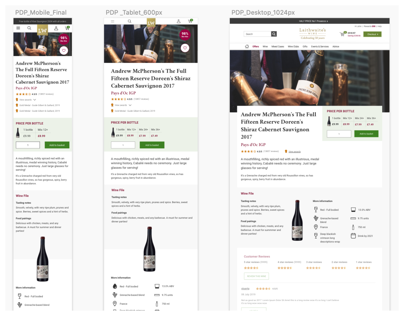
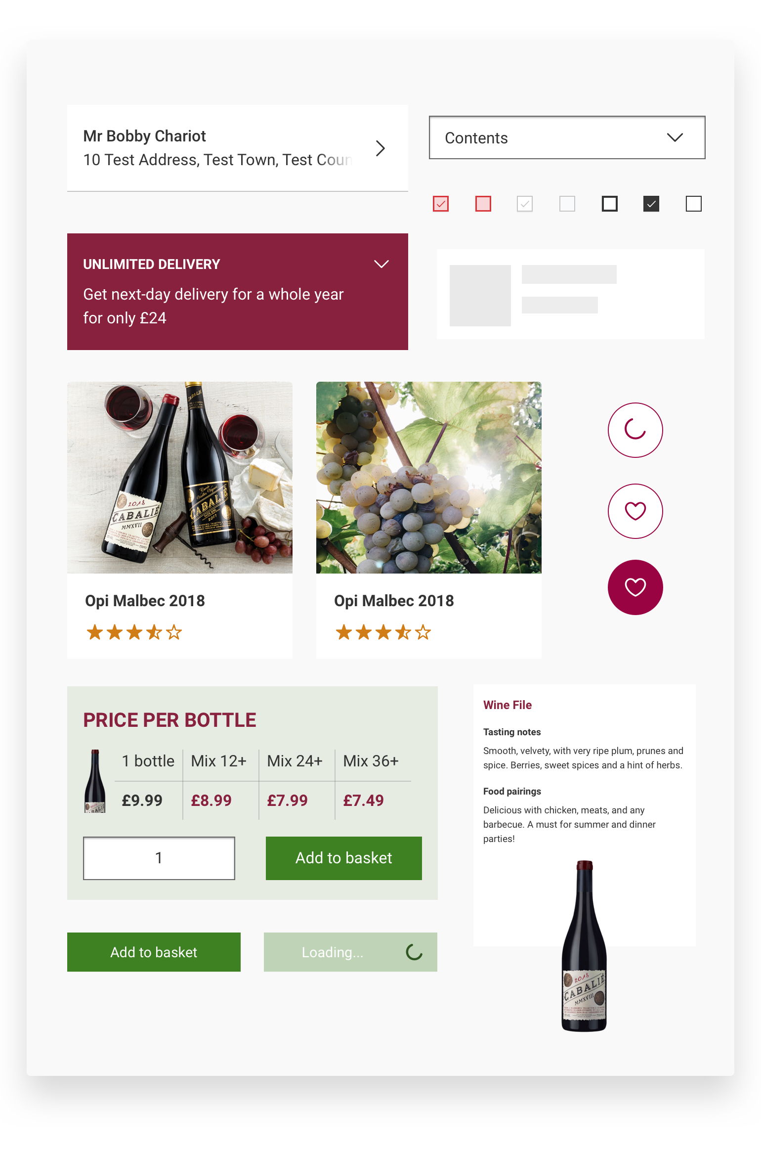
UI guidelines were non-existent and all designs only existed in Photoshop. We coached the client through Agile design processes, tools such as Sketch & Zeplin, and built an atomic design system from scratch.
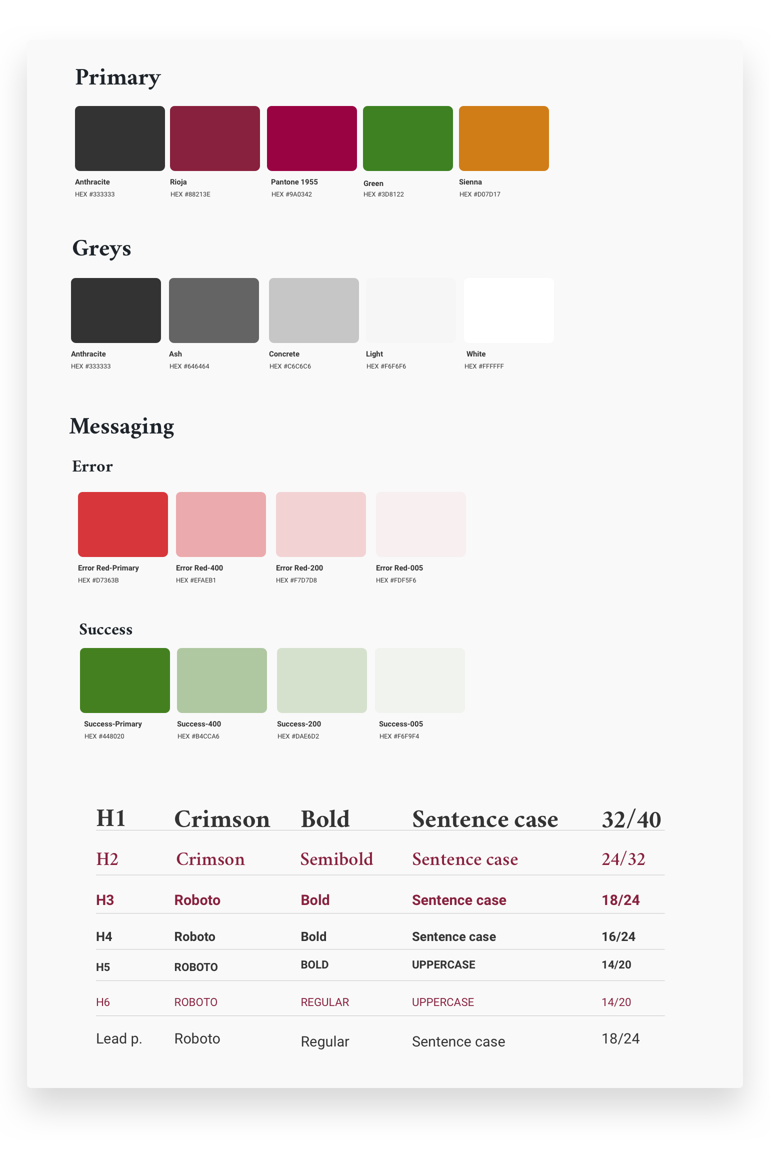
We simplified the colour scheme, inclunding a spacing scale, layouts and grids guidelines, and included 3 viewports in our new approach.
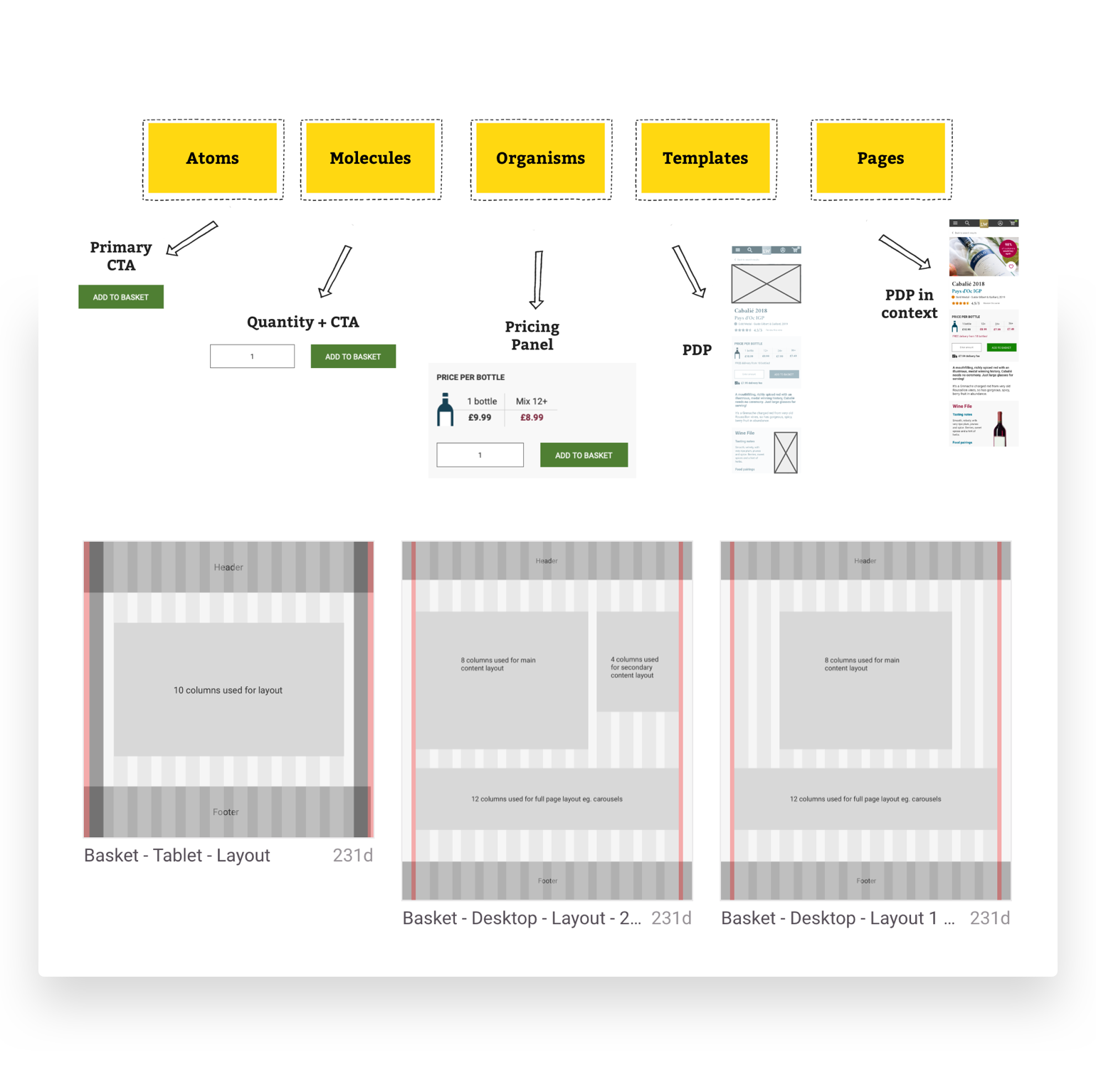
We redesigned while sticking to existing brand guidelines so that newer components wouldn’t be too jarring.
The result
