Backbone
Is watching too many cat videos just as bad as leaving the tap running? Maybe.
Backbone is a website raising awareness of the internet’s environmental impact.
It simplifies complex information in a user-friendly way, via enticing graphics, videos, and relatable storytelling.
Concept
The internet is far from being a land of pristine Clouds.
It is a complex machine, running on air-conditioned data centers, submarine cables, and the extraction of rare metals we can’t recycle yet. My friends and I wanted people to know that.
Backbone compiles scientific expert interviews, key data points, and thoughtful storytelling to educate the public on 3 points :
- The physical reality of the network
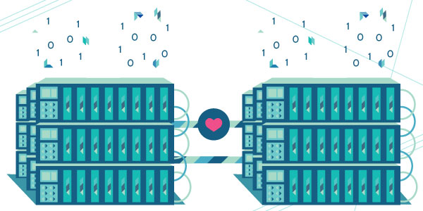
- The functioning of data-centers
- Best practices for eco-friendly browsing
Challenges & Goals
Make scientific data digestible
Produce original content – including expert interviews – using a light-hearted tone and plenty of visual cues
Raise awareness of materiality
Remind that the Internet is materialized by data centers, cables, and countless physical terminals
Empower citizens & companies
Supply users with a concrete list of actions to immediately reduce their online carbon footprint
UX personas
Based on the personas we had created, I wanted to site to cater for different levels of reading.
It needed to:
- Be easily skimmable, or allow for a deeper read
- Look visually engaging
- Guide users to the Best Practices section quickly
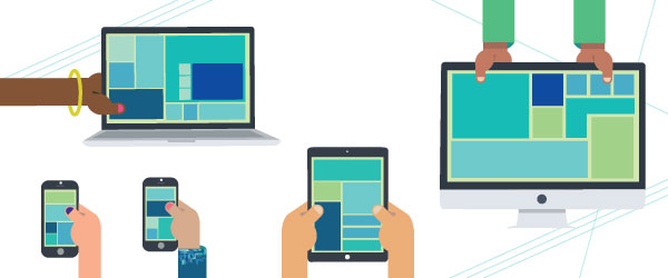
- Be responsive and mobile-first


The navigation is simple and features each theme – Network, Data Centers, Internet Users, and Best Practices – as a self-contained page. At the bottom of each page, the user is seamlessly guided to user to the next link of the chain.
Wireframes


Branding
Positioning
I wanted to present Backbone as an independent actor within the digital research ecosystem, and stand out from the pack of classic-looking research sites.
Why ‘Backbone’?
We referenced the Internet’s palpable dimension. « Backbone » was the name of the first civil computer network created in 1989 by the National Science Foundation.
Logo Sketches
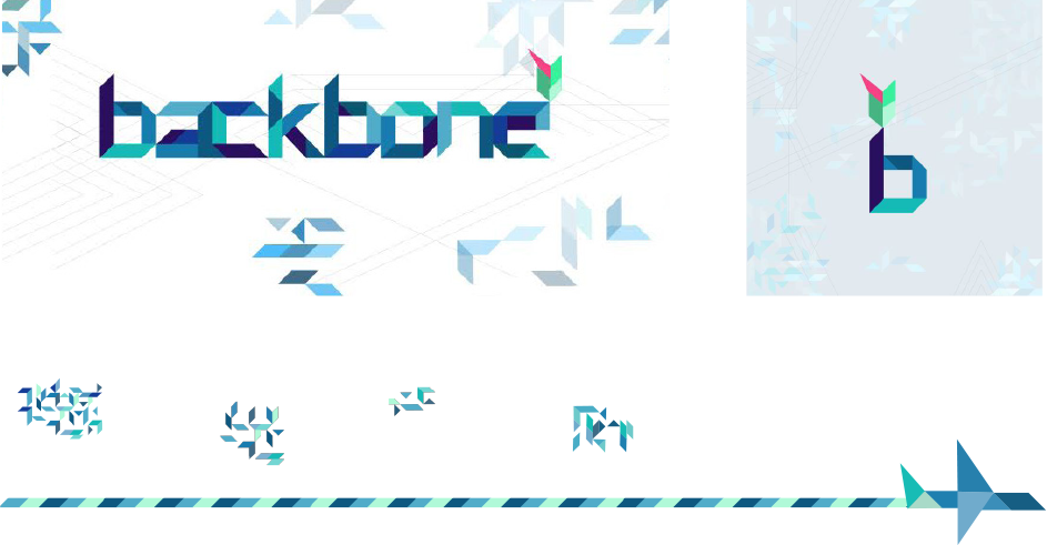
The logo had to convey references to the environment, the internet, and hardware.

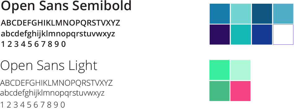
I eventually settled on a wordmark-based logo composed of several polygons, creating an original typeface.
When disassembled and reorganized, the shapes compose reccurent patterns around the whole site. While the basis is geometric, the visual system then conveys a more organic feel.
Combined with secondary elements such as lines, the shapes are also rearranged to create illustrative assets (plane, cables, satellites).

Custom illustrations & gifs
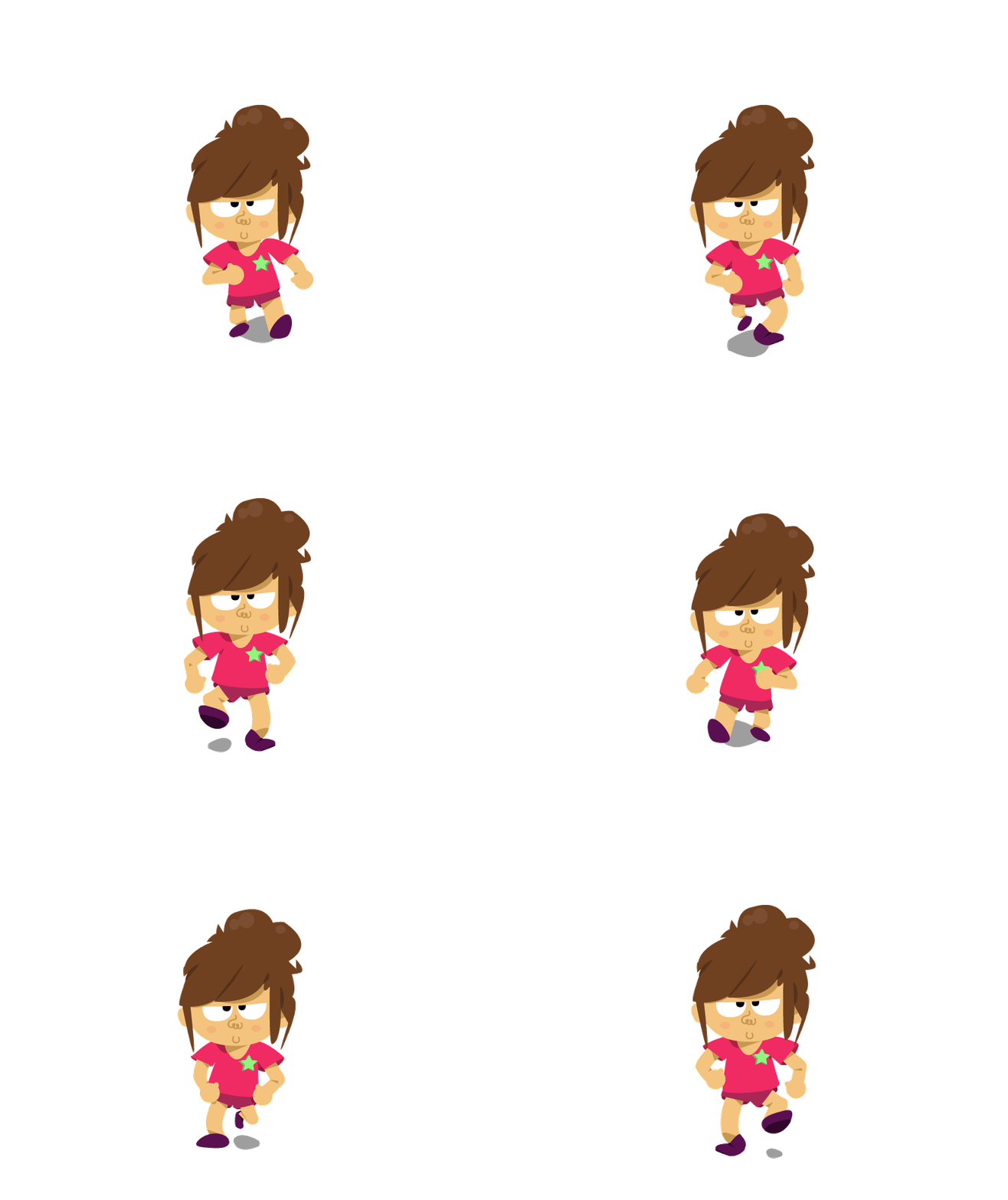
To improve accessibility, I designed two mascots, a series of illustrations and gifs, and tied the user journey around a simple storyline.
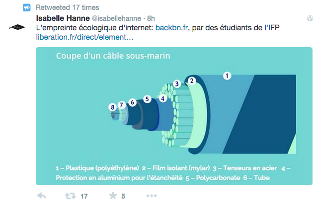
The site also features scientific illustrations, maps, and curated photos and videos.

Motion Graphics
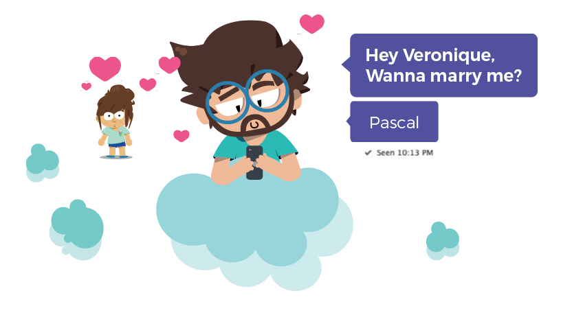
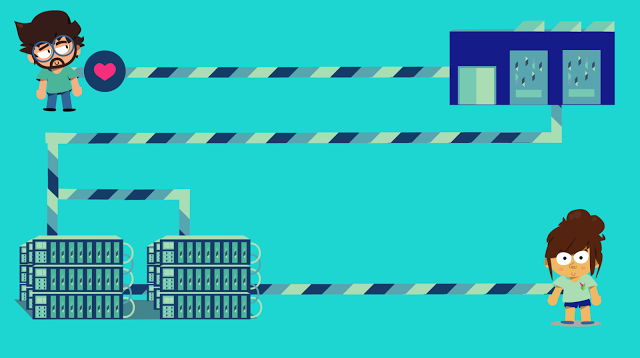
Meet Pascal.
A typical 20-something, he heavily relies on the web to go about his daily routine. Madly in love with his girlfriend Veronique, he finally takes the leap and pops the question. Via email.
Romantic, instantaneous, and carbon-free.
Right?
In anticipation fort the launch, we released a video trailer outlining the main didactical points of the site (physical cable network, data centers, terminals and best practices), using the journey of a single email as an example.
I took care of the entire content production, including scriptwriting, storyboarding, and animation.
Watch the 2mn video below.
Outcome
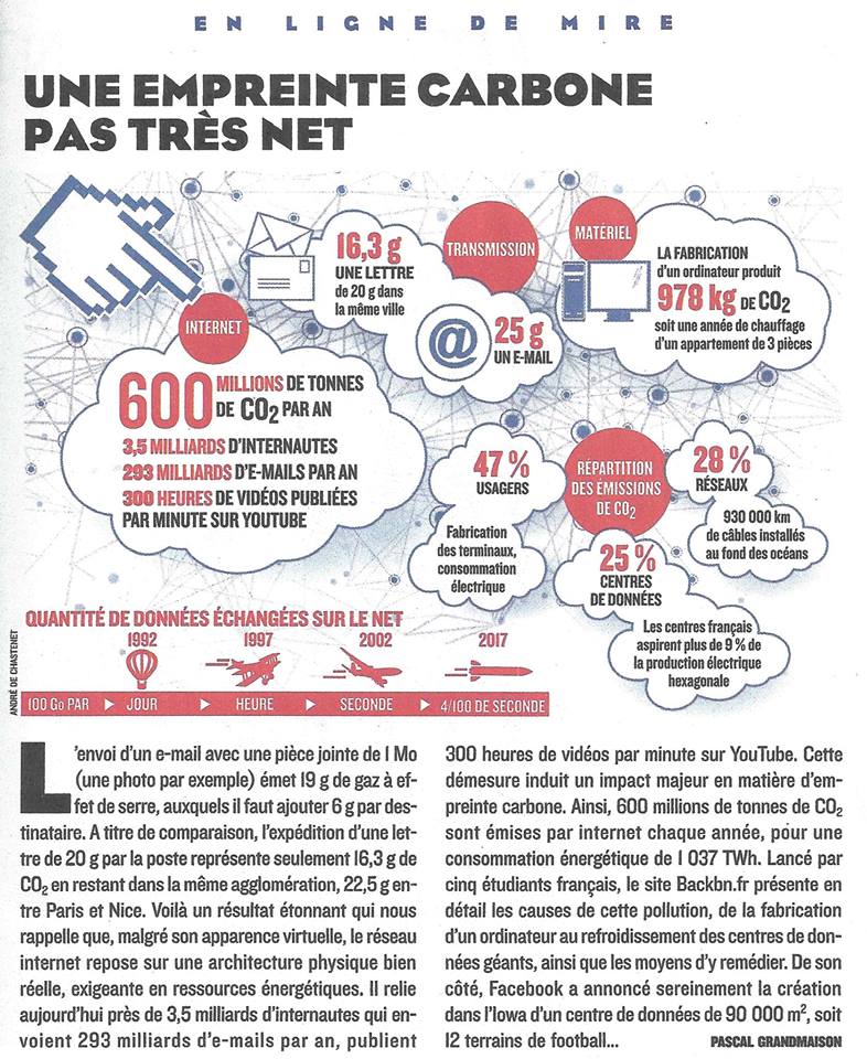
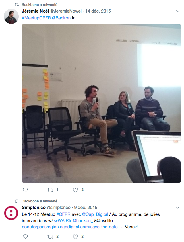
The month following the launch, Backbone was featured in two national newspapers, and on national public radio. We were invited to speak at several conferences around the country.

